Get 40 Hours Free Developer Trial
Test Our Developers for 40 Hours at No Cost - Start Your Free Trial →
Do you remember when you had to pinch and zoom to view anything on your phone’s shrunken version of a desktop site? You weren’t getting the best out of it!
In 2015, Google changed its algorithm so that it now considers a website’s mobile presence when ranking results. It was named Mobilegeddon at the time. This alone justifies the importance of responsive design!
On a smartphone, a website must be user-friendly.
Leads and sales may be lost if it isn’t.
A poor mobile experience has led 40% of users to visit a competitor’s website.
What does a responsive website do? This is the first question that comes to mind. And why does it matter? What are the benefits? Why is it necessary? How cost-effective is it? Almost all of your questions will be answered after reading this article.
What is a Responsive Website?
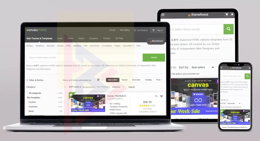
Responding to something and adapting to its environment is what responsive means. But what does that mean for a website? Adapting to your smartphone, tablet, phablet, etc. Environment and responding according to its size is the same thing. Today, people are using a variety of gadgets, each with a different size, so if they are using a small mobile phone, they must zoom in or resize the content to be able to view it. For instance.
People use their smartphones today to check their emails, but they have to zoom in on certain pages in order to read the text since some Smartphones are very small in size and we cannot see the text clearly on them.
In the case of responsive websites, they will automatically adapt themselves to the size of the screen on the Smartphone, tailor their layout, and craft them so that you can easily read them even on a small Smartphone or a large tablet. With a responsive website, you don’t have to zoom the text, resize it, or navigate it to read it, because you can read it regardless of the screen size.

As more consumers began using mobile devices in the mid-2000s, developers became more aware of responsive web design’s benefits. While trying to make their websites look good on desktops, smartphones, and tablets, designers quickly realized that flexible layouts were essential. Thus, they developed websites that adapted to users’ devices.
Currently, mobile devices are used more than traditional laptops and desktops to access the web, so the field continues to evolve.
Source: Comscore
Mobile-unfriendly websites will eventually go out of business. Businesses must embrace responsive web design in order to reach a wider audience of potential customers. Developers should also grasp this concept.
A brief history of responsive web design
Audi.com, launched in 2001, was the first to adapt its layout to the width of the browser window. It was common to use terms such as “fluid,” “flexible,” “liquid,” and “elastic” to describe the same concept prior to developer Ethan Marcotte coining the phrase in a 2010 essay. “Responsive Web Design” is the title of a book that Marcotte wrote in 2011.
The principles behind the benefits of responsive web design
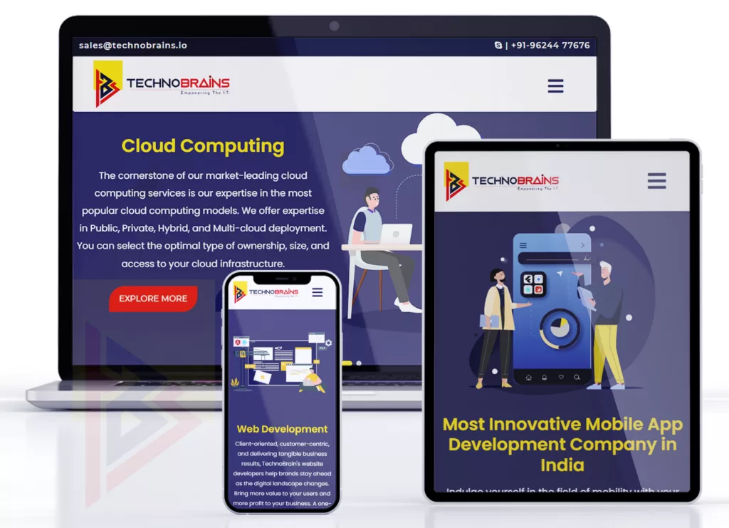
How responsive web design works depends on a few key principles. In this section, we will discuss three main components of responsive web design.
Fluid grids
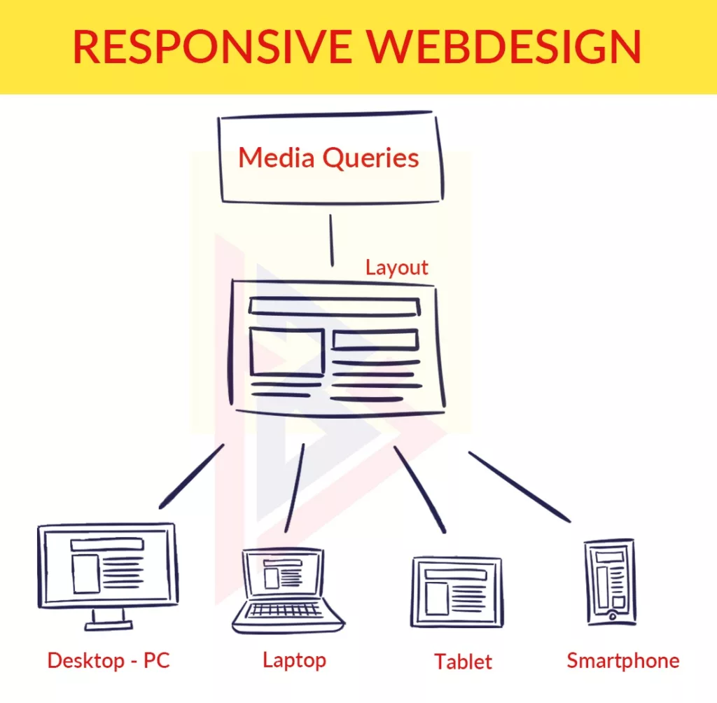
As opposed to fixed-width layouts that appear the same on every device, fluid grids adapt to the user’s screen. The term “fluid grid” is sometimes used interchangeably with “liquid layout”, but fluid grids ensure that all elements are resized in relation to one another.
Divide each element’s width by the page’s width to find the appropriate proportions. A high-quality mockup made from pixels in an image editor can be used to take measurements. Rounding values will result in inaccurate proportions in your layout.
Media queries
There is only so much that fluid grids can do. Media queries are necessary because browsers have become narrower, which creates new challenges. The majority of modern browsers support CSS3 media queries, which lets websites collect information about individual visitors and apply CSS styles conditionally. When the browser window falls below a specified width, the min-width media feature automatically applies specific CSS styles.
When the viewport is less than 1100px, the media query above tells the browser to not display the foobar class.
Read here, why your next app should be developed in Flutter?
Flexible images
Images should be resized when using responsive web design. Use CSS’s max-width property to make sure images load in their original size unless the viewport is narrower than the image’s width.
Having the maximum width set to 100 percent will result in images shrinking proportionally as the browser or screen becomes narrower. By enabling the browser to resize images according to CSS rather than specifying height and width within the code, you can simply avoid declaring height and width. Older versions of Windows may have issues rendering images when resized.
While sizing images, you should also keep load times in mind. When a large image is resized on a mobile device, it can cause significant slowdowns. This is why you should use responsive image attributes like SRCset and sizes.
Why Responsive Design is Important for Business
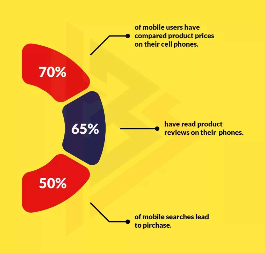
- Expand client and customer reach by using smaller devices (tablets & smartphones)
- Lead generation, sales, and conversions can be increased by a consistent experience
- Tracking, reporting, and analytics can all be done from one place
- Managing content on-site takes less time and costs less
- Make sure you’re ahead of the competition (44% of Fortune 500 companies aren’t mobile-ready at the moment).
You can also offer a mobile-friendly experience by using two other methods. Dynamic Serving, on the other hand, uses a different HTML and CSS code for the same URL. They serve up the appropriate code based on the device they are being viewed on.
A separate mobile site is the second method. Mobile users are directed to a different mobile-specific URL when they visit a mobile device.
In any given situation, the most useful method really depends on the steps taken to optimize for mobile users. Make sure you know what will work best for your online presence before you get started.
Google is responsible for over 5.7 billion web searches per day.
Responsive web design is Google’s recommendation for mobile-friendly sites.
You can even test how well your page performs on a mobile device by using Google’s mobile responsive test. Just enter the URL of your page and see how it performs.
Why responsive website:
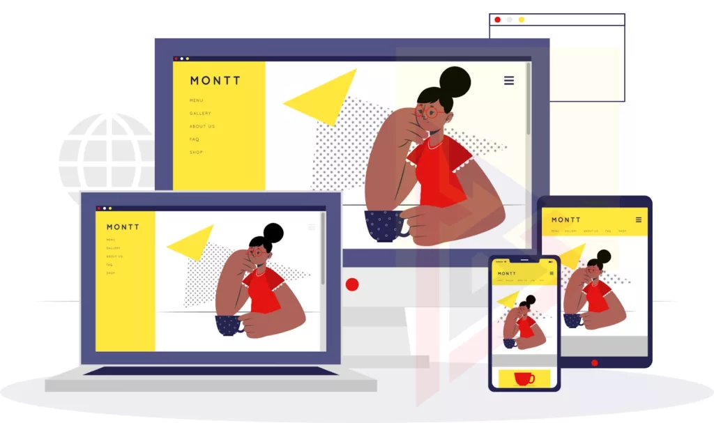
Fluid Sites: With fluid sites, the content floats and adjusts to fit your mobile or tablet’s screen.
No scrolling: Since it adjusts itself automatically based on the screen size, you don’t have to scroll or zoom.
Single website: With a responsive website, there is no need to download any other mobile sites for your phone, so your customers don’t need to switch between websites.
M-commerce: People nowadays are starting to shop online, and they are doing it via mobile devices as well, hence the name m-commerce. A responsive site requires one site to be created, and you can use it on multiple devices, whether they are computers, mobile phones, or tablets.
Cost-benefit:
At first, it might seem that development costs are a bit high, but once your project is finished, you won’t need to hire anyone to maintain all the versions. When you update the website, all you have to do is make a single update. That will be more economical over time.
Advantages of Responsive Web Design
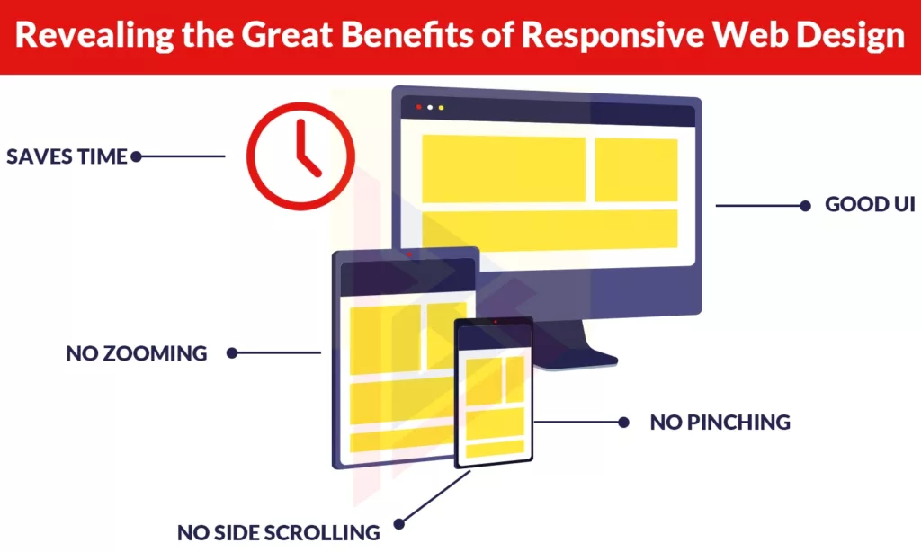
The benefits of responsive web design are numerous. This can improve your search engine optimization, conversion rates, user experience, and other important aspects of your business. Here are the top 12 features and benefits of responsive web design.
1. Improved User Experience
Improved user experience is the result of a responsive website. The length of time users spend on your site is a major indicator of the quality of the user experience. If they have to constantly pinch and zoom in order to navigate or use your website, they won’t stay on it.
Visitors won’t encounter difficulties accessing menus, links, buttons, or filling out forms if your website scales and responds to the change in screen size. As a result, they will have a better user experience and spend more time on your site.
You can then increase your word-of-mouth referrals and customers by improving user experience and site usability.
2. An Increase in Mobile Traffic
Mobile devices accounted for nearly 52% of global web traffic in the last quarter of 2017. More than half of all Internet traffic is driven by mobile devices, which proves that you simply cannot ignore responsive design. Investigate how many of your visitors access your site from mobile devices and how long they spend on it. Compare the two numbers after implementing responsive design. You will notice an increase in mobile visits and a longer time spent on the site once your site is configured for the viewport width.
3. Faster Website Development
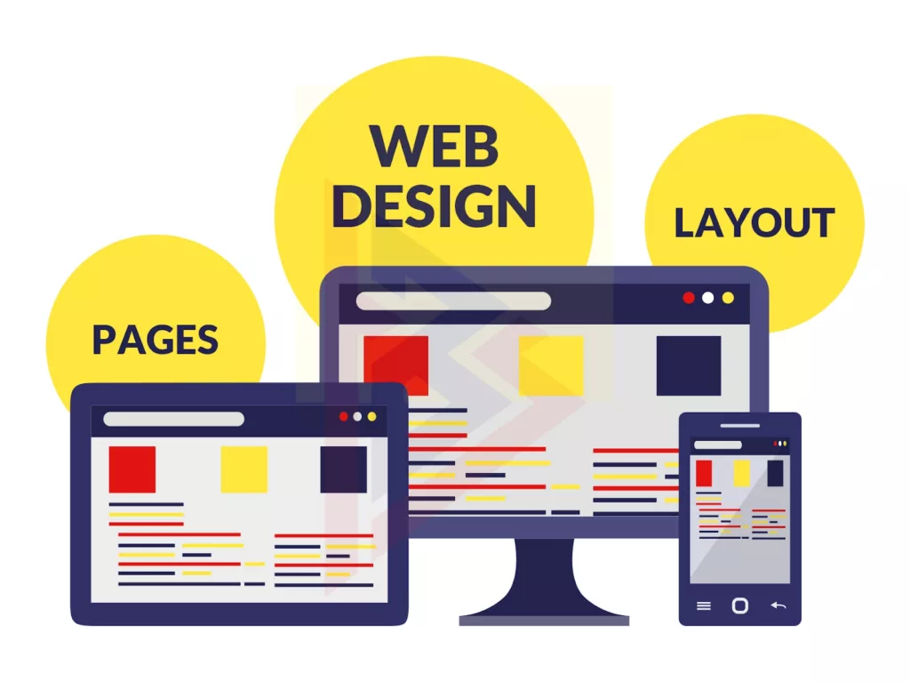
In the past, people used to make a separate mobile version of your site when they detected a smaller screen size. Developing a mobile version of your site will take more time than developing a responsive website that looks great and works well no matter what device your visitors are using. Additionally, a mobile version of your website costs more than a regular one because your developer has to build two sites instead of one.
4. Easier Maintenance
Easy website maintenance is directly related to the point above. When you have two versions of your website, your development team has to devote more time and resources to managing them. Having a responsive website allows your staff to spend more time on other tasks, such as marketing, A/B testing, customer service, and developing products and content.
5. No Duplicate Content Penalty
It’s also important to remember that duplicate content is created with two versions of your site. While search engines are becoming more and more intelligent, they still need to determine which version of a site is more important. Your content remains the same, regardless of the URL, if you’re using a mobile version of your site.
Search engines won’t know which content is relevant, so both versions of your website will have lower search engine rankings. Both desktop and mobile versions of your site require separate SEO strategies and campaigns, as well as significant investment in creating original and unique content.
Most website owners resort to using the canonical tag on their mobile website that refers to the desktop version since two separate SEO strategies would take too much time and money. Thus, most separate mobile websites are not indexed by search engines.
You can avoid all of the above headaches by using a responsive website. The following should help alleviate any doubts you may have about the importance of responsive web design.
6. Simpler Website Analytics
You need to track two sets of analytics when you have two different versions of your website. This will help you understand where your visitors are coming from and how they react to your content. In other words, you have to manage multiple signups and thank you pages, conversion points, funnels, and so on.
On the other hand, when you have a responsive website, you can keep track of all your website stats in one place. The information you get will still help you understand which devices and browsers your visitors are using, where they drop off, and how long they spend on your website, but you will no longer need to go through multiple reports to get an accurate picture.
7. Better Website Loading Times
A responsive website will load faster than a non-responsive website on all devices, including smartphones and tablets. Fluid grids and responsive images make it much faster for your site to load, which directly affects how long it takes to load for your users.
In research, 53% of mobile site visitors will abandon the site if it takes more than three seconds to load. In the same study, it was found that websites that load fast are more likely to have visitors spend more time on their website. The importance of responsive web design cannot be overstated.

8. Lower Bounce Rates
A bounce rate refers to how many visitors to a particular website leave the site after only viewing a single page. In addition to reducing bounce rates, a responsive website means visitors will stay on your site longer if it is responsive. You’ll be able to keep visitors on your site longer and encourage them to read other pages on your site.
9. Higher Conversion Rates
In order to improve your visitor’s experience and establish trust, you should spend more time on your site and lower your bounce rate. Whether conversion occurs through a newsletter subscription, a purchase or a telephone call, an improved user experience and trust will lead to higher conversion rates. When you consider that the average smartphone conversion rate is 64% higher than that of a desktop website, responsive websites become essential.
10. Better SEO
Search engine rankings are also improved with responsive web design. Google began taking into account a website’s responsiveness as one of the factors in determining its position in search engine results pages as of April 2015. A mobile-friendly website, on the other hand, will show up higher on the results page if it does not pass the search engine giant’s responsiveness test.

11. More Social Sharing
Your content can receive more social shares if you use responsive web design correctly. Responsive web design offers you this benefit as well. Sharing links to your site’s pages is easy when you use responsive content and responsive social media buttons. The result is more traffic and more conversions, as well as greater credibility and exposure. As well as influencing your search engine rank directly, social signals can also affect your rank indirectly as search engines will recognize the increased engagement and search demand.
12. Better Backlinks
Furthermore, building backlinks can be a big benefit of having a responsive website. The purpose of backlinks is to tell search engines that your site is a reputable source of information, which is key to any SEO strategy. Your website won’t be linked to as much if it’s not responsive. It makes them look bad if they link to a site that provides a poor user experience.
Tips for realizing the benefits of responsive web design
1. Prioritize “extreme” viewport sizes
As of today, many frontend frameworks automatically resize the viewport for us, so in most cases, there is no need to define these values manually.
2. Model what happens between breakpoints
Your application can’t be designed to look the same on every screen. Visitors will see layouts that are between the sizes you target a lot of the time. In order to prevent elements from sizing down or columns from collapsing improperly, designers must think about what happens between breakpoints. In the interim stages, sketches or even wireframes might be helpful for modeling how web pages may look.
3. Embrace feedback
Most designers want to protect their work, but getting feedback from others always leads to better products. Separating duties is important, but developers must attend product meetings, brainstorming sessions, and usability testing sessions. You can benefit from the collective knowledge of your team members.
The future benefits of responsive web design
The study of responsive design will only become more complex as the number of devices on the market continues to grow exponentially. Despite the easy assumption that responsive web design benefits have already been established, the field is still young. There will be no shortage of novel challenges in the future as people access the web from virtual reality headsets and smartphones are enabling entirely new types of applications such as augmented reality games.
Developers will be concerned about reducing maintenance costs, improving search engine optimization, and improving conversion rates in the future. Recently, responsive design has been focusing on accommodating smaller screens, and this trend is not expected to slow down. The point is, however, that users with larger displays also need to be considered so that they have a similar experience.
How can TechnoBrains Help You in Responsive Website Design?
TechnoBrains‘ expertise in responsive web design along with its experience of developing web applications for more than a decade has resulted in a positive experience for its customers. By providing the same user experience on all devices without adding any extra cost to the project. Customers are able to take advantage of the latest surge in devices. In the shortest time possible, the ROI is positive.
We are a partner of choice for responsive web design projects for web applications and websites. At TechnoBrains understand the customer’s project vision, and implement methods to ensure effective communication and execution. We offer extra advantages when it comes to UI and UX.


