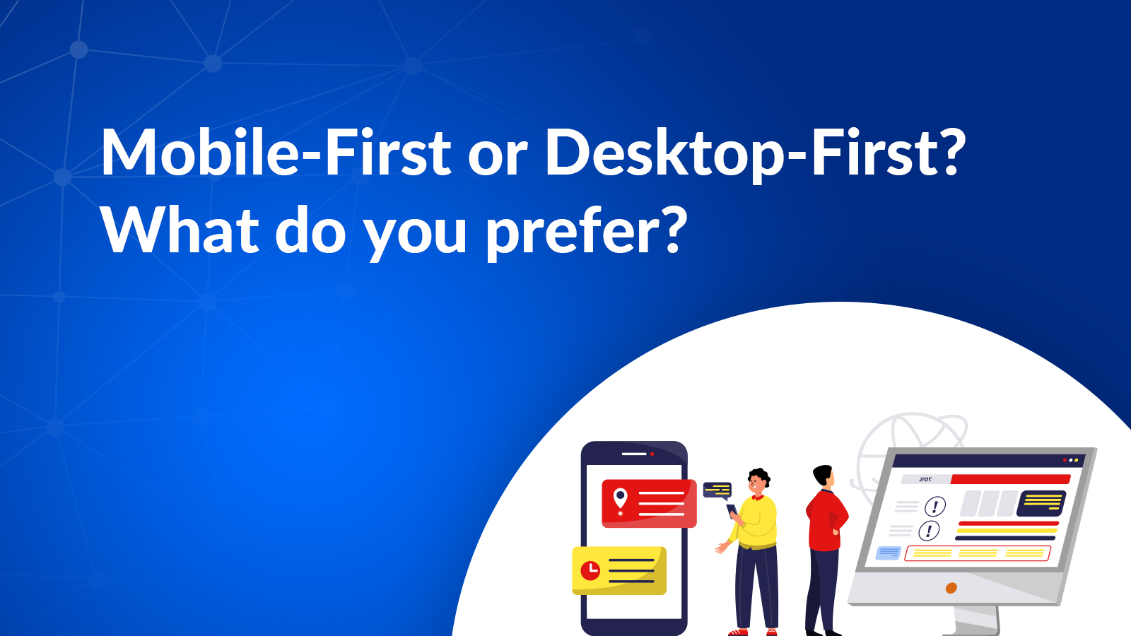
Mobile-First or Desktop-First? What Do You Prefer?
Would you like to establish a significant online presence for your new business? What if you simply wanted to expand the reach of an old traditional business by having a website? Have you come up with a brilliant idea for a tech start-up that will revolutionize the industry? Perhaps it is neither of the two, […]

15 Dec, 2021
Would you like to establish a significant online presence for your new business? What if you simply wanted to expand the reach of an old traditional business by having a website? Have you come up with a brilliant idea for a tech start-up that will revolutionize the industry?
Perhaps it is neither of the two, but do you create customized websites for any of the above mentioned companies? Before you get started with web design, you should ask yourself one question: what is my strategy for ensuring responsiveness? At the moment, you have only two choices to choose from mobile-first or desktop-first.
Benchmarking the competition may seem like an easy way of making a choice, but it is actually more difficult than it appears. You need not worry since an experienced custom web development company can help you develop a responsive strategy. To do so, they analyze your business from many financial and technical perspectives.

Understand The Difference: Mobile-first Vs Desktop-first Strategies
What do you mean by responsive strategy?
A responsive strategy is a way of designing your website so that the end user gets an excellent experience regarding content, navigation, download speed, screen resolution, etc. Through their device.
Businesses need to be able to attract and engage the maximum amount of traffic to their websites due to the increasing penetration of the internet. So, whether a mobile-first strategy or a desktop-first strategy is of the utmost importance in luring the target audience.
Let’s now compare Mobile-first vs. desktop-first approaches:

Desktop-first Responsive Strategy
Your target audience usually uses big screens such as laptops and desktops, so you should design a display with the maximum amount of information, so as to communicate as effectively as possible. If you are designing a desktop application, you focus mainly on delivering an engaging, detailed, and fluid user experience.
You wrap or hide some elements when you are aiming for small screens. Our aim is to maintain the original functionality. When it comes to mobile websites, you tend to focus less on the user experience and more on the operational aspects.
Businesses with a transactional nature are ideal candidates for this approach. The reason is that most of the work is done on a desktop or laptop.
When businesses decide to develop mobile apps, this type of design is also used to optimize the user experience on mobile devices.
Also Read, Importance of Responsive Web Design.

Mobile-first Responsive Strategy
More and more people will rely on their pocket-sized friends for doing online work as smartphones become more affordable and cheaper data packages become available. It is not surprising that Indian mobile application development companies are making fortunes out of this since corporations can smell this.

Despite both mobile-first responsive websites and mobile apps having the same goal – to optimize the user experience on mobile devices – their origin is entirely different. While a mobile-first approach is mainly based on the core functionality of a website with layers added to it that allow it to run on a larger screen, a mobile app is its own platform entirely.
In order to organize the content accurately on the basis of importance, a mobile-first strategy demands a lot of research.
The mobile-first strategy may be easier to start with the most essential elements, but many designers believe that it restricts their imagination because the canvas given to them is too small to paint on.

In terms of technology, let’s compare Desktop-First and Mobile-First approaches:
Tabular Mobile-first vs Desktop-first Comparison
| Property | Desktop -First | Mobile-First |
| Resolution Transition | This approach follows “Graceful degradation” from higher resolution formats to lower resolutions | This approach follows “Progressive Enhancement” from lower resolution to higher resolutions |
| Text Quantity | More | Less |
| Font Size | Smaller | Larger |
| Download Speed | Slower | Faster |
| Call to Action | More than one call to action per page | One call to action per page |
| Access to hardware | Not so easy to access other hardware on the device. | Easy access to flash light, camera, microphone, etc |
| Best Works on | Desktops | Mobile phones |
Which Strategy is Better: Mobile-First vs. Desktop-First?
A decision between two choices could not be made if there were no parameters. Sadly, it is not as easy as it sounds. To answer this question, it is often proper to say, “It depends”.
What does it depend on?” you asked. The following are some factors you can consider to take advantage of one side of the two for your business.
What kind of customers do you have?
Are you likely to attract visitors to your website? Are they more likely to use smaller screens? Through the use of big data analytics solutions, the answer to these questions will simplify your life. 80% of site traffic follows the rule of thumb. You should strategy if 80% of your traffic comes from desktops. Similarly, a mobile-first strategy makes sense if 80% of your traffic comes from mobile devices.
User-interface:
Your website should be desktop-first if it is going to be full of features, options, and content. If you prefer a simpler UI with a limited number of features and options, go for the second option.
Product type:
If your product is going to be a tool or service that helps other businesses be more productive, such as software, then you can choose to focus on desktops first. You should use the mobile-first approach for your product if it is about entertainment, news, travel, networking, etc.
Budget:
Last but not least, your website design should not burn a hole in your pocket. The development of a custom website can be cheaper when you outsource to India. Depending on your budget, this could be incredibly inexpensive or extremely costly.
When creating your website budget, you must be clear about what you can afford to spend. Mobile-first approaches typically cost more. Mobile-first approaches require a great deal of research and structure.
You will pay less for simple desktop websites. Furthermore, the cost will also vary depending on how complex and what features are incorporated into the site.
Also Read, why your next app should be developed in Flutter.
When Desktop-First Is The Most Appropriate:
- Desktop hits: account for more than 80% of your traffic or 50% of your hits, but desktop sales are significantly higher
- Site interface: contains many features
- Supplemental support for core functions: dedicated mobile apps for Android and iOS
- Creative design: As part of your marketing strategy, you favor complex and enhanced visuals
- Product type: This product is intended for desktop use, for example as a productivity tool or business service
- User Experience: Desktop and mobile options should be highly refined
- Resources: Your budget and time are limited, yet your product needs to be changed
When Mobile-First Is The Most Appropriate:
- Mobile hits are 80% or more of your traffic or 50%, but the sales are significantly higher on mobile
- Features: A handful of core features and/or several well-defined selling features
- Product type: Entertainment, lifestyle, networking, news, or another on-the-go category
- Design: Simple and minimalistic
- User Experience: Optimized mobile; modest desktop
- Resources: Time and money to build a future-proof base from scratch
Changing Your Current Strategy
Before developing your strategy, you should thoroughly assess it. If you wait too long, you may regret your decision. You might introduce new features, change how your product is used, or change how your analytics are calculated. The best course of action may be to make a change if it is clear that a shift is needed, rather than continue with an ineffective strategy.
Optimizing For Mobile After A Desktop-First Strategy

In general, a degradation from a desktop to a mobile version results in a loss of user experience. Some desktop technologies simply cannot be accessed on mobile devices, and a fallback solution is needed, which is likely to be complicated and costly to implement.
This change may include adding:
- User flow that is mobile-friendly
- A user interface that supports touch & swipe gestures, scrolling, and zooming (in addition to multi-touch/multi-finger interactions)
- Advanced style elements and HTML elements will be supported by mobile browsers (with fallbacks and polyfills).
- General mobile best practices (do not use hover state, box shadows, opacity, iframes, or vertical layout; do not manipulate DOM or make network requests)
Read here, why your next app should be developed in Flutter.
Optimizing For Desktop After A Mobile-First Strategy
It’s a less costly mistake to make because there are rarely any technical modifications required. Large screen areas, however, remain unused and functions remain unexpanded, often lacking titles and visual guides where there is adequate space to incorporate them. The brand needs to be expanded sometimes when the design is not ready for a more creative visual.

This change may include adding:
- Narrative text addition
- Creative library expanded
- Infographics based on illustrations
- Rotators for images
After carefully evaluating the pros and cons of each method, you should decide what’s best for your business. It doesn’t matter if you have to change your current strategy, the strategy that best suits your company will pay off in the end.
You should carry out your own research and analysis before making a final decision. Our own personal preferences may be the best ones.
Our verdict
You must convert desktop content into mobile-friendly content if you want your site to rank well. We recommend moving your desktop-first site to mobile-first (responsive design). Please use Google MFI with responsive design, not “m.”
To make your desktop content mobile-first, you need to rethink your content. Combine text, images, and audio to create short blog posts. Optimize your content for search engines. Use consistent formatting across all devices and platforms. Make sure your images are small enough to be visible on mobile devices.
Ensure that you understand the differences between desktop content and mobile-first content. Thus, grow your business by going with the flow. Create the best mobile user experience by prioritizing your content in the mobile-first strategy. Cut down on download times and ensure that the experience is identical across all platforms.
Creating content that is not just mobile app friendly or desktop-friendly but also user-friendly is the buzzword and you need to tailor your site and content accordingly.
Come, talk to us and we shall advise you depending on your business type.